Erewhon
Accessibility Assessment
Role: Accessibility Specialist
Duration: 5 weeks - 2023
Tools & References: SortSite, WAVE, WCAG2.1
Executive Summary
The Erewhon website has some severe and critical accessibility issues that hinder the shopping experience of users with mobility and/or vision issues. Navigation solely via keyboard presents issues like tabbing missing key touch points in the experience, like the search filters on the search results page and the “Ingredients” tab on the product page. For visually impaired users, issues include VoiceOver incorrectly reading and/or missing key areas in the interface like the hamburger menu, the stepper that is used to add products to the cart, and the number of items in the shopping cart, which stands in the way of completing a purchase.
The website code needs to be reviewed to make the areas mentioned earlier accessible via methods like adding semantic markup to explain to users what an interface component does, what it means, and how to use it. Another essential step is to make all key touch points of the shopping experience keyboard-focusable.
Methodology
To conduct the assessment, I used three methods:
1- Automated code inspection:
This is a fast and comprehensive method. I used a combination of tools like SortSite (a tool for scanning websites for accessibility issues) and WAVE (a Chrome extension) that gives a quick analysis of the accessibility of a website and lists the different issues encountered. Automated scans do sometimes include errors that do not necessarily impact the website accessibility, or it can miss errors that require a qualitative judgment, like how well the ALT text represents a particular image. This is where manual code inspection is needed.
2- Manual code inspection:
I examined the site’s code for issues like mobility, i.e. navigating the website (does tabbing follow a logical order that is the same for users without disabilities? Does it allow users to skip to the content they want? Can users rely solely on the keyboard for navigation?, etc.), and vision (how the website handles zooming, resizing text, tagging images, etc.). Manual inspection is significantly more time consuming that automated, but it is indispensable for identifying a different class of errors.
3- Experience walkthrough:
I emulated the experience of a user with disability while interacting with the website. I used JAWS and VoiceOver, zooming in, resizing text, adjusting the site’s contrast, etc. I would go about using the website to accomplish a certain task and would pause if I encounter a problem and describe what happened. The final report would be a story-like recount of the experience. Although an experience walkthrough might not exactly match that of a person with disability, it does provide a more realistic account of a user as they interact with the website.
I employed three criteria for the experience walkthrough:
1. How well the site supports the use of assistive devices such as screen readers,
2. The degree to which the site is navigable without a mouse or trackpad, and
3. Whether the pages allow visitors with disabilities to understand where they are and what they can do.
Scope
In this evaluation, I covered the following areas of the site:
● The home page
● The search results page
● The product page
Background
WCAG 2.1
WCAG 2.1, or the Web Content Accessibility Guidelines are a set of thirteen guidelines determined by The World Wide Web Consortium (W3C) that define how to make web content more accessible for people with disabilities. W3C is the global authority on web content and therefore their guidelines on accessibility are considered a universal standard. W3C reviews its guidelines periodically and publish new editions on their website w3.org. These guidelines stem from four main principles that spell the world “POUR”. Below is a quick overview of these principles:
WCAG principles
1 - PERCEIVABLE
Information and user interface components must be presentable to users in ways they can perceive.
2 - OPERABLE
User interface components and navigation must be operable, i.e able to be used.
3 - UNDERSTANDABLE
Information and the operation of user interface must be easy to understand.
4 - ROBUST
Content must be solid enough that it can be interpreted reliably by a wide variety of user agents, including assistive technologies.
Audit Process
Automated code inspection
I did the automated inspection using:
● SortSite, a software that scanned the website’s code for WCAG 2.1 non-conformance incidents that could lead to
accessibility issues, and,
● WAVE, a Chrome extension that scans for accessibility issues, including website structure, order of tabbing, and missing alt-text.
The use of both tools together helped me achieve a thorough analysis. Both automated and manual inspections are documented on the same table. Results of automated inspection are labeled AUTOMATED Inspection to distinguish them from the manual ones.
Manual code inspection
I inspected the code against the guidelines that the automated one did not cover. Also, the inspection included attempting to use assistive technology to test for some issues pointed out by the guidelines and trying to understand where the code failed to achieve conformance and how that reflected on the output on the web pages inspected. I used VoiceOver (iOS), and keyboard navigation. Both automated and manual inspections are documented on the same table. The results of the manual inspection are labeled MANUAL Inspection to distinguish them from the automated ones.
Experience walkthrough
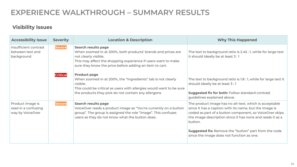
Experience evaluation was a twofold task. First, I attempted to interact with the website like someone visually impaired would. For that purpose, I used the zoom-in function of Chrome, in addition to VoiceOver (iOS). The objective was to see if some key tasks, like navigating the homepage, searching for a product, and adding it to the cart would be easily accomplished. Second, I attempted the same activities, assuming the role of someone who cannot use a trackpad or a mouse for navigation, only a keyboard. The experience walkthrough is presented in a separate table with issues labeled as minor, severe, or critical, where “minor” means a task can still be accomplished, “severe” means users will face difficulty while attempting to achieve a task, and “critical” means a task cannot be performed because of an accessibility issue.
Results
Automated and manual code inspection
Both inspections confirmed the presence of the following issues:
● Coding some key interactive components, like images, without specifying their function makes them inaccessible and hinders the shopping experience.
● Failing to code key touch points as keyboard focusable, leads to users missing out on parts of the experience or being completely unable to accomplish a task.
Experience walkthrough
The experience walkthrough yielded results that align with the automated and manual audits. The two main issues detected are:
● Coding some key interactive components, like images, without specifying their function makes them inaccessible and hinders the shopping experience. These components are:
○ Hamburger menu on the search results page and product page
○ The (+) sign under each product on the search results page
○ Stepper on the product page
○ The number of items in the shopping cart
● Failing to code key touch points as keyboard focusable leads to users missing out on parts of the experience or being completely unable to accomplish a task. These touch points are:
○ The hamburger menu on all three pages
○ The filters on the search results page
○ The stepper on the product page
○ The “Add to Cart” button on the product page (this one only has the text on the button focusable and not the whole
button, and it was missed during tabbing since the focus box color was the same as the button itself)
○ The “Ingredients” tab on the product page
Recommendations
● Most of the discussed issues are Level A non-conformances, and, therefore, need to be dealt with as a high priority since they critically impact the shopping experience.
● Avoid coding interactive elements as “images” since this confuses users and does not reflect the correct function of the component, resulting in task failure (The hamburger menu cannot be coded as an “image”).
● Add appropriate semantic markup to code elements to help users understand the experience (e.g. explain that the number represents the number of items in the shopping cart).
● Code key interactive components to be keyboard-focusable.
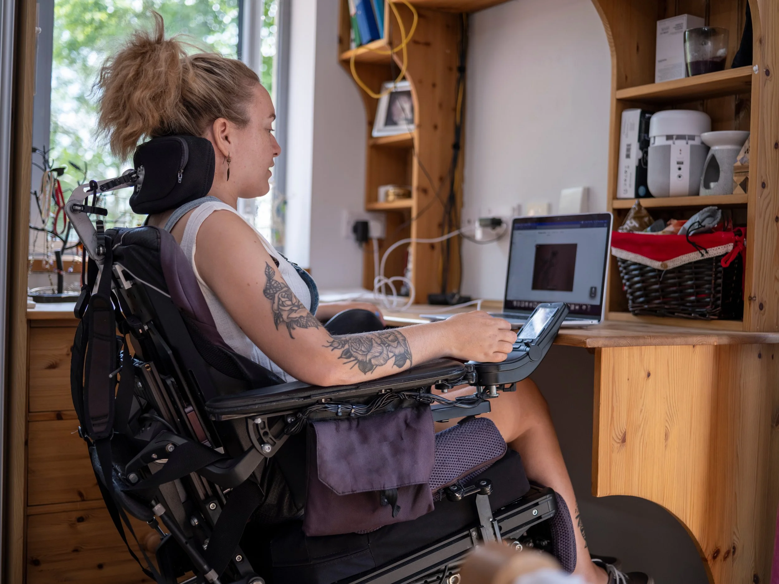
● Although these three methods of inspection gave some good insights into some of the most critical accessibility issues, testing the Erewhon website with actual users with various disabilities is invaluable for grasping an even more comprehensive understanding of where it falls short. Think-aloud testing sessions and observing users in their typical environment are just two examples of activities that should help in this respect.


