Hi, I’m Ayat Elamrawy,
And this is my not-so-typical UX portfolio.
I’m a UX designer and researcher in Los Angeles. I help organizations plan and build accessible websites, apps, and brands that work for everyone.
You won’t find the standard Research → Ideate → Wireframe → Prototype → Test pipeline here. Sometimes meaningful feedback means going straight from Research to Build. Other times I’m not building anything at all, but making sure an existing experience includes everyone. And when it matters, I go past the expected solution to create one that builds lasting relationships rather than just driving quick conversion.
Lately, I’ve started integrating AI into my workflow, and I’ve become increasingly conscious of my role in the collaboration. While I let AI tools expedite research, partner in strategy conversations, churn out ideas, and even design screens, I strive to remain the guide and decision-maker — a partnership I’m adjusting to and learning from, and one that keeps evolving.
Welcome to my space!
Featured Projects
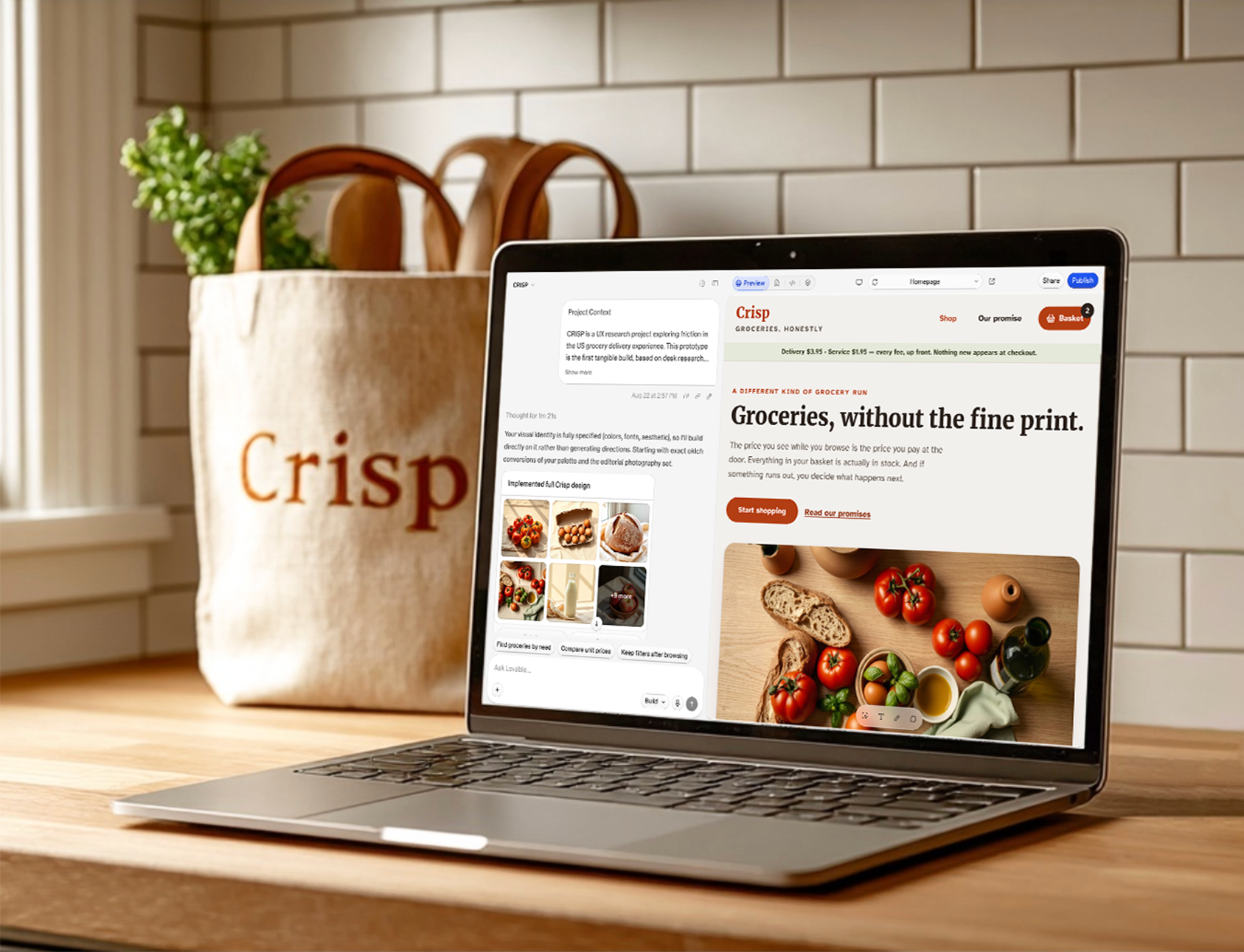
AI-Integrated Workflow | Design Log | Self-initiated
CRISP
A design log of how I work with AI, with grocery delivery as the test case

Product Strategy | Emotional Design | Experience Design
Washington Post: Brand Nostalgia as a Path to Future Loyalty
Today’s KidsPost reader, tomorrow’s Post subscriber
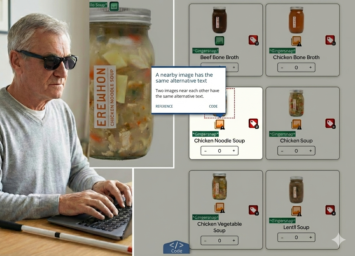
Accessibility Audit | E-Commerce | Inclusive Design
Uncovering Silent Barriers at Erewhon
Dismantling digital exclusion and resolving friction to create an inclusive experience
Usability Testing

ZAPPOS
Task success ranged from 60% to 100%, depending on whether navigation matched expectations.
The lowest score came from adding a gift card to cart (3 of 5) — the feature was buried under "Collections" and even search didn't help. Tasks with a clear navigation path, like finding the return policy (4 of 5) and signing up for promos (5 of 5), succeeded far more consistently.

SMARTNEWS APP
All 12 participants customized their feed, but 0 did it the way the design intended.
After tapping "Go to My Feed," participants expected to see the topics they'd just selected, but landed on generic top news instead. Their actual selections were hidden under a separate "Following" tab that all 12 failed to discover on their own.