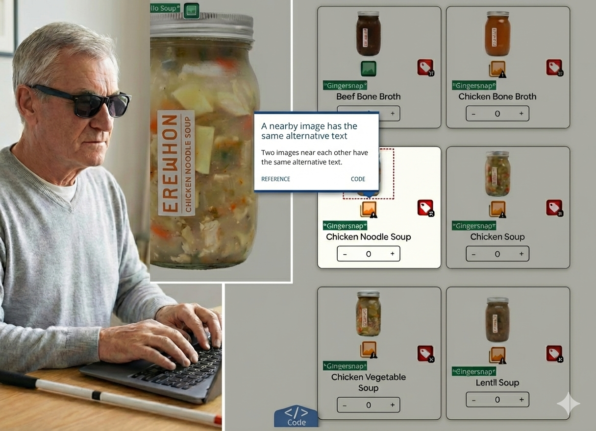
Left: Persona simulation. Right: Persistent accessibility errors verified in the current site redesign.
Uncovering Silent Barriers at Erewhon
An accessibility audit to dismantle digital exclusion
Role: UX and Accessibility Specialist
Methods: Automated and manual inspections | Experience walkthrough
Tools & References: SortSite, WAVE, WCAG2.1
Executive Summary
Challenge
The Erewhon website exhibits several critical accessibility issues that affect users with mobility and visual impairments.
Key Findings
Keyboard Traps: Search filters and "Ingredients" tabs are unreachable without a mouse.
Silent Navigation: VoiceOver fails to announce the hamburger menu or cart updates.
Blocked Purchase: Quantity steppers and cart counts are invisible to screen readers.
Recommendations
To address these issues, the site’s code should be reviewed for proper semantic structure. This includes implementing ARIA roles, labels, and descriptive markup to clarify component functionality. Additionally, all interactive elements in the shopping flow should be made keyboard-focusable.
Scope
Home Page • Search Results • Product Detail Page
Methodology
I evaluated the Erewhon digital experience against WCAG 2.1 Level AA standards. While technical compliance was the baseline, the goal was to identify barriers across the four fundamental principles (Perceivable, Operable, Understandable, Robust). To ensure a comprehensive audit, I utilized a triangulated approach as follows:

Automated Code Inspection
Automated tools are the first line of defense for catching structural syntax errors.
The Goal: Rapidly identify non-conformance issues like broken heading hierarchies and missing alt text.
The Tools: Used SortSite for site-wide code scanning and WAVE to visualize structural gaps in the site’s underlying structure.

Manual Code Inspection
Since automated tools catch only about 30% of errors, manual review is critical for a comprehensive audit.
The Goal: Uncover interactive barriers that code scanners miss, such as trapped focus states or illogical tab orders.
The Tools: Conducted deep-dive audits using VoiceOver (iOS) and Keyboard-only navigation to simulate the assistive technology experience.

Experience Walkthrough
Compliance does not always equal usability. This step tested the actual friction in the shopping experience.
The Goal: Measure the cumulative impact of small bugs on a user’s ability to complete a purchase.
The Process: Simulated core user journeys, including Search, Add to Cart, and Checkout, to identify friction points that block task completion.
Key Findings
The triangulation of automated and manual testing revealed a consistent pattern: while the visual interface looks fine, the underlying code structure creates critical barriers for assistive technology users. The audit identified two primary themes of exclusion:
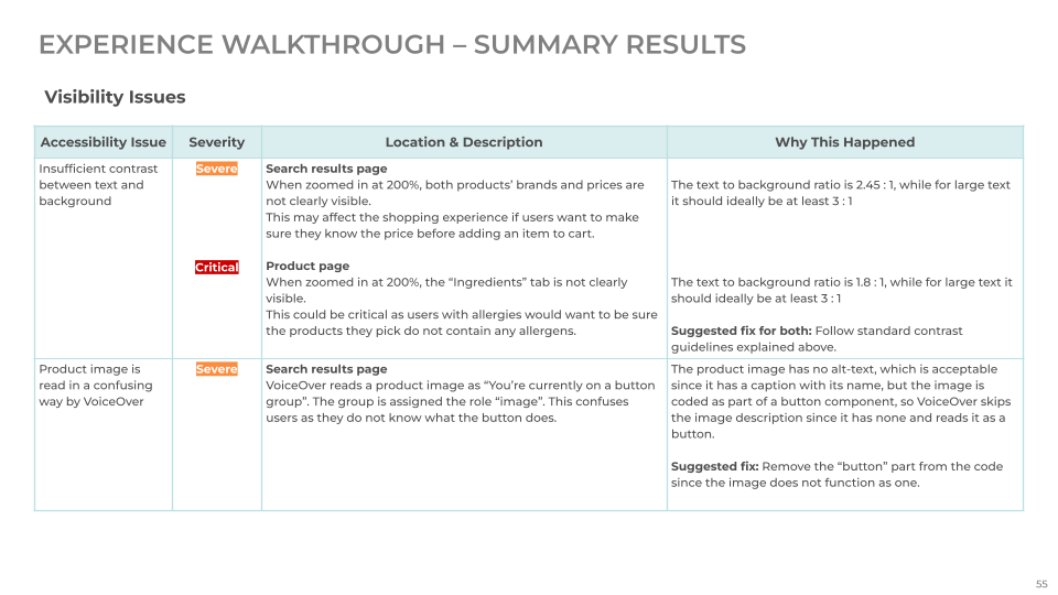
Raw data from the experience walkthrough revealing a pattern of missing labels on interactive elements.
Theme 1
The "Silent" Storefront (Semantic Gaps)
The Issue: Key interactive elements, including product images and status indicators, lack semantic labels.
The Impact: Screen reader users are navigating in the dark. Without descriptive tags, the "Add" button is just an unread graphic, and the "Cart" status is invisible, making it impossible to complete a purchase.
Specific Evidence:
The [+] icon on the product page is unannounced.
Product images are wrongly coded as part of a button.
The Ingredients Tab on the product page is skipped entirely by VoiceOver.
Theme 2
The Navigation Dead-End (Keyboard Traps)
The Issue: Critical touchpoints are coded as static elements rather than interactive buttons.
The Impact: Keyboard-only users face a "digital wall." They can see the path to purchase but cannot physically enter it because the focus state skips essential controls.
Specific Evidence:
The Hamburger Menu and Search Filters are unfocusable.
The Quantity Stepper cannot be adjusted via keyboard.
"The “Add to Cart” button has two issues: only the button text is focusable (not the full button), and its focus indicator is the same color as the button itself, making it invisible while tabbing."
Recommended Action
Phase 1
Technical Remediation
Prioritize high-impact updates to unblock essential shopping tasks.
Fix Static Controls: Convert non-semantic elements (like the Hamburger Menu and Search Filters) into true <button> elements to restore keyboard focus.
Add Accessible Labels: Add Aria-labels to icon-only buttons (like a cart or search icon) and status indicators (like the item-count badge) so screen reader users receive clear feedback on their actions.
Phase 2
Process & Validation
Maintain these measures to ensure an inclusive experience moving forward.
Inclusive User Testing: Conduct periodic testing sessions with actual users with diverse disabilities to catch real-world friction.
Accessibility Guardrails: Establish accessibility checks in the development workflow so these gaps do not reappear in future updates.
Retrospective
While the automated tools provided data, the manual walkthroughs gave me truth.
This audit challenged me to look beyond the "happy path" and confront the real-world friction that excludes users. It was a powerful reminder that accessibility cannot be an afterthought; it must be the foundation of any interface that claims to be intuitive or inclusive.