
CRISP
Grocery delivery built around trust, not pressure
OPEN BUILD
This is a live design log — decisions, research, and mistakes are documented in real time.
ON WORKING WITH AI6 . 4 . 2026
The AI collaboration is documented upfront because it is a fundamental part of how CRISP is being built.
The partnership
This project is built with two AI design partners from day one: Claude (Anthropic) and Gemini (Google). Both were customized with domain knowledge, skills, and project context — not used as generic tools, but as trained collaborators with a defined role in the design process.
The process
The partnership covers every layer of the work: from strategy and research to visual decisions and design-to-code implementation. It involves real dialogue — including pushback from both sides — with final decisions remaining mine.
The intent
This is a deliberate workflow experiment: integrating AI as a design partner from the start, not as an afterthought. It is one of the things that makes CRISP distinct as an open build.
01 / THE EXPERIENCESTATUS: ACTIVE
4 . 18 . 2026
5 . 12 . 2026
CORRECTION
6 . 25 . 2026
Vision statement updated to reflect current product direction: age targeting removed, reverse curb-cut effect and elegant accessibility definitions refined
I am building CRISP to restore trust and agency in the grocery delivery service for experienced adults by leading with value and respect. My mission is to embody 'elegant accessibility': the belief that by designing for specific human needs, we create a more intuitive, frictionless experience for everyone.
I am building CRISP to restore trust and agency in the grocery delivery service for experienced adults by leading with value and respect. The target is to embody 'the curb cut effect': the belief that by designing for specific human needs, we create a more intuitive, frictionless experience for everyone. The experience will embody ‘Elegant accessibility’ — my vision to steer away from the utility-like feel typical of digital products, aiming to serve aging users.
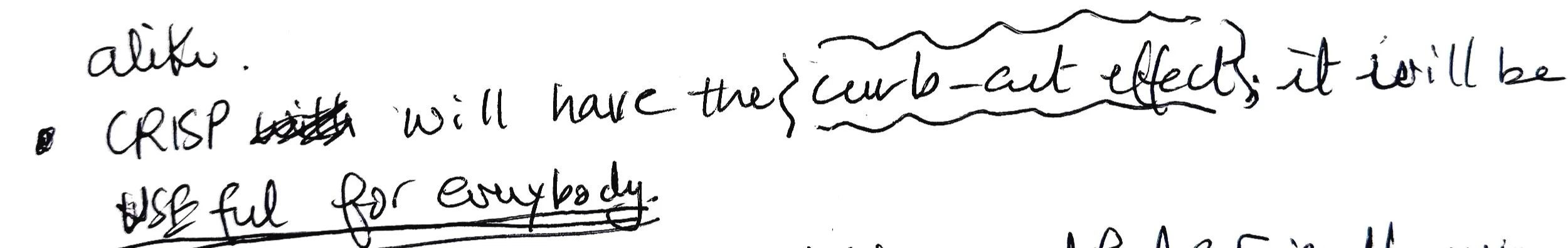
I am building CRISP to restore trust and agency in grocery delivery by leading with value and respect. The experience is designed around the reverse curb-cut effect — designing for everyone so that no one, including the senior user CRISP was originally designed for, is singled out or left behind. CRISP embodies “elegant accessibility”: accessible design that distances itself from the utility feel typically associated with the term — an experience that feels editorial without intimidating, and inclusive so no one feels left out.
The numbers
Only 12% of adults 55 and older shop for groceries online (USDA Economic Research Service, 2024) — and 64% of adults 50+ say technology is not designed with them in mind (AARP, 2024).
02 / RESEARCHSTATUS: ACTIVE
In hindsight, quantitative context should have preceded qualitative research. Added retroactively —
6 . 8 . 2026
4 . 20 . 2026
What the numbers mean
Desk research reveals a landscape of friction for older adults: mandatory account creation acting like a gatekeeper, intrusive data collection, and the noise of unsolicited recommendations.
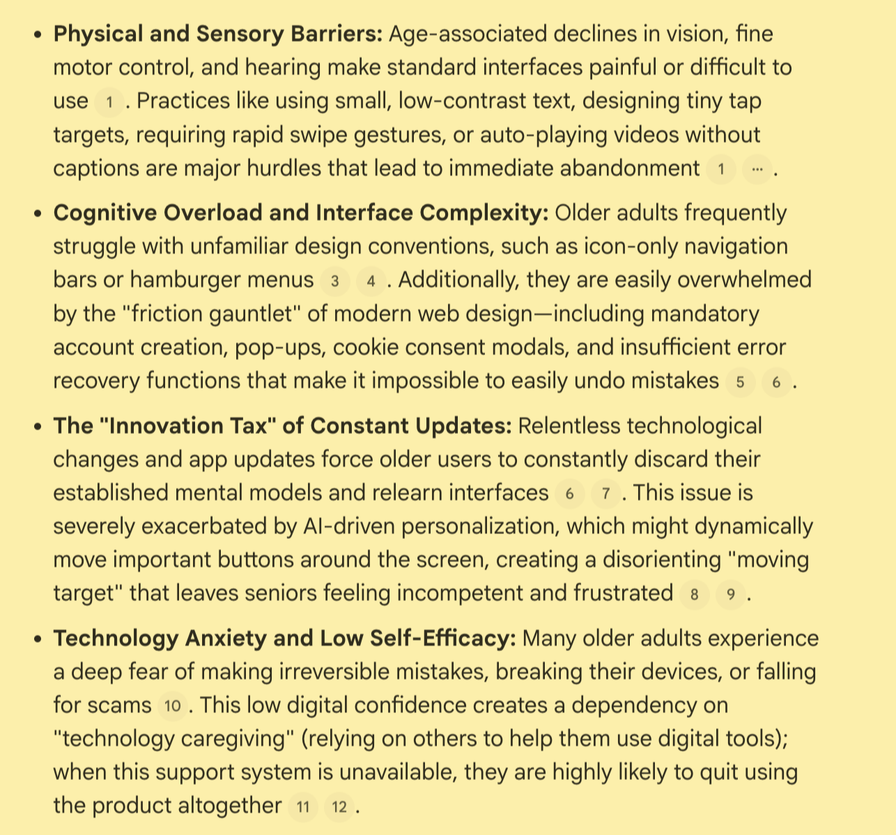
Artifact 2.1 / Aggregated research findings: usability, physical, and cognitive barriers
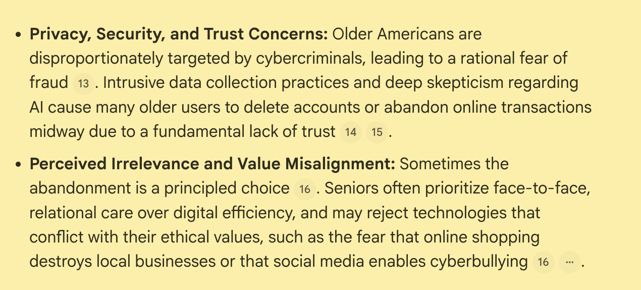
Artifact 2.2 / Aggregated research findings: trust and value alignment
STATUS: IN PROGRESS
5 . 11 . 2026
— Potential candidates identified
Neighbors 60+
Local senior center visitors
My Pilates buddies who are 60+
6 . 3 . 2026
— Process began
6 . 8 . 2026
— Dual track revision
6 . 18 . 2026
— Routing question
— Interview intro added
—Frequency question moved from screening to user track; 'never' option removed to avoid contradiction with routing logic.
6 . 29 . 2026
— Taking a 3-week break. Resuming 7 . 22 . 2026
Interview prep & process
Initial interview questions assumed grocery delivery usage. Desk research (USDA ERS, 2024) shows only 12% of adults 55+ shop for groceries online — making non-users the statistically dominant profile. Interview guide revised to a dual-track structure: one track for non-users exploring barriers and conditions for adoption, one track for users exploring experience and satisfaction. A dedicated routing question was added to the screening process to determine which track applies to each participant before the interview begins.
-
Thank you for your time. Before we start, why don't you tell me a bit about yourself — what your day-to-day looks like, so I have some context.
-
5 . 10. 2026
How often do you use grocery delivery services?
Never
1 - 3 times/month
4 or more times/month
Only respondents who use it 4 or more times/month will be interview candidates. Familiarity with the experience is a key factor for the credibility of the replies.
5 . 11. 2026
How old are you?
60 — 70
71 — 80
Over 80
Almost missed that one! I have been internalizing the age factor the whole time that I forgot to explicitly mention it.
All respondents in these ranges are interview candidates. The granular brackets are intentional — the needs and friction points of a 62-year-old may differ significantly from those of an 82-year-old. CRISP is designed to serve the full spectrum of senior experience.
6 . 15 . 2026 — age question removed
The age question is irrelevant now since I will apply the “reverse curb-cut effect”. If I am designing for everyone, age should not be a screening question, but simply part of the interview intro questions.
6 . 15 . 2026 — frequency of use reframed
Frequency of use will be the only screening criterion, but in this case it’s not about letting people in or out, but about ensuring a balanced pool of participants.
6 . 18 . 2026
Routing question (asked first): How do you currently handle grocery shopping? → If exclusively in-store: continue to non-user track. Otherwise, continue to the user track.
-
How do you currently manage grocery shopping?
How would you describe your current grocery shopping experience — what works well and what doesn't?
Why didn’t you try grocery delivery?
What would need to be true for you to consider trying it?
Are you using any other delivery service, like food delivery or Amazon?
What makes you use these services?
If there is one thing you could change about these services, what would it be?
-
How often do you use grocery delivery services?
1—3 times/month
4 or more times/month
Frequent users (4+ times/month) provide credibility through familiarity. Occasional users (1—3 times/month) may reveal why commitment is hard to sustain. Non-users may reveal the barriers that prevented adoption altogether. All three perspectives are valuable to CRISP.
Initially, I was going to consider only frequent users — that would have been a missed opportunity.
What made you start using grocery delivery?
How would you describe your current grocery delivery experience to someone who has never used that service before?
What do you like most about the service you use? What frustrates you? Could you elaborate on why you feel that way?
Were you using a different one in the past? Which one? What made you stop using it?
What would make you switch to another service? Why?
If there is a “dream grocery delivery service,” what do you expect out of it? (updated 5 . 31 . 2026)
How does the service you are currently using make you feel? Why do you feel that way?
The emotional question is intentionally last — respondents reflect on their feelings after articulating opinions, not before.
03 / VISIONSTATUS: ACTIVE
4 . 22 . 2026
What CRISP is about
To maintain project focus, I began by sketching the core experience principles that would govern every design decision that follows.
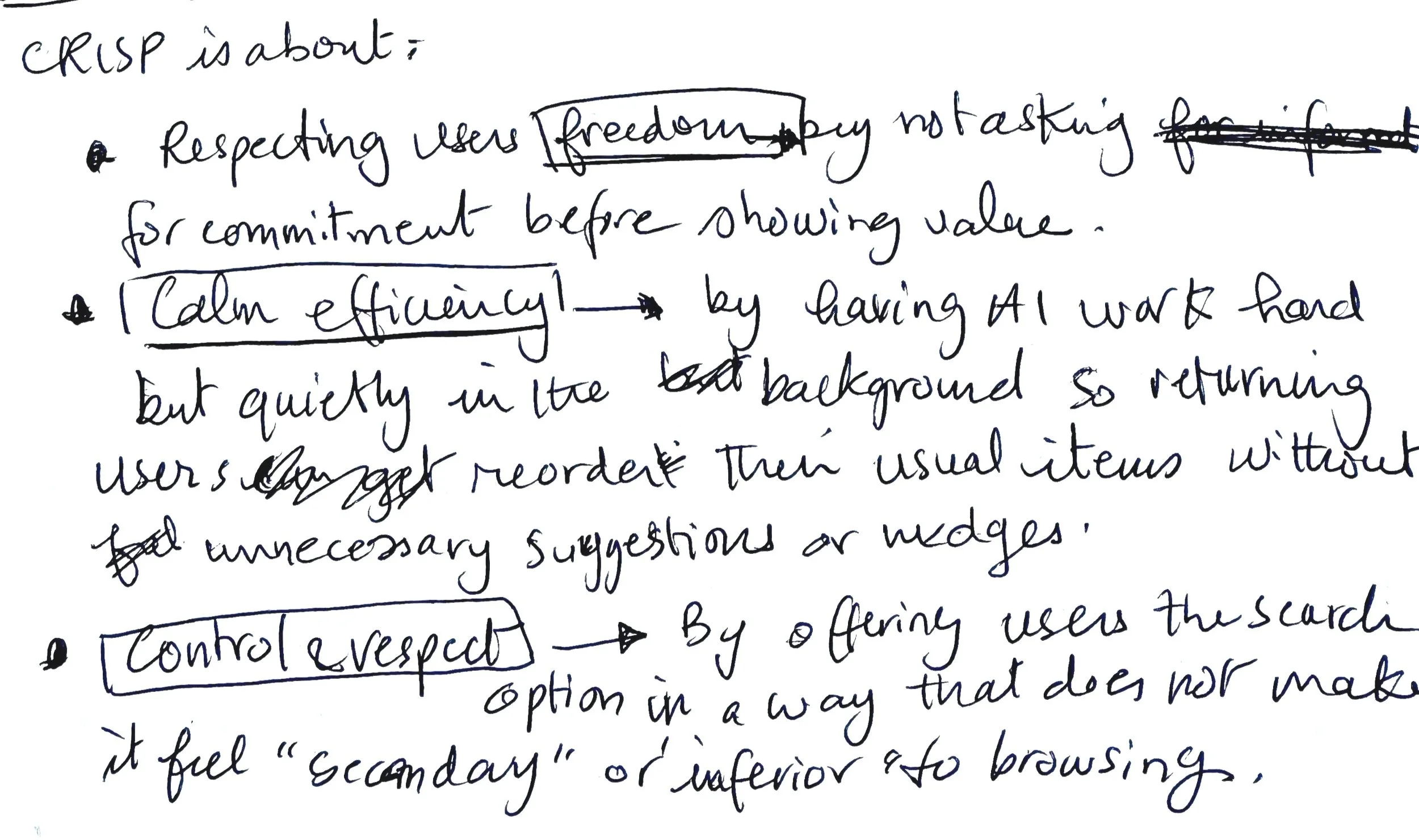
Artifact 3.1 / Freedom, efficiency and respect
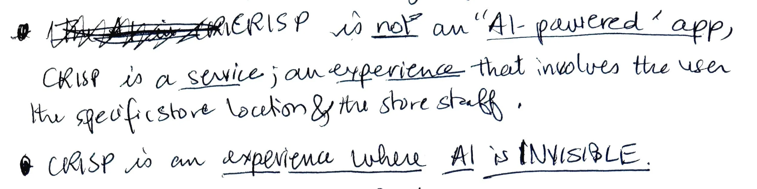
Artifact 3.2 / Invisible service
Artifact 3.3 / Emotional tone
Artifact 3.4 / Universal design
5 . 26 . 2026
Added for clarity
These sketches led to the six testable system constraints, defined below.
04 / DEFINITIONSTATUS: ACTIVE
FOCUS: EXPERIENCE LOGIC
5 . 3 . 2026
5 . 26 . 2026
— Constraints expanded from 4 to 6 to align with vision pillars.
System constraints
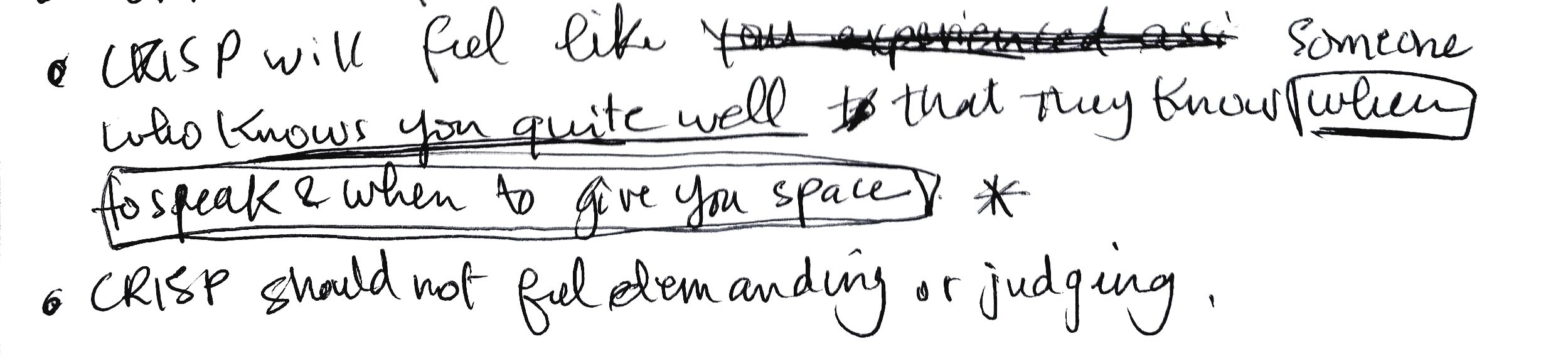
Trust — The system will request information only when strictly necessary and only after demonstrating value.
Agency — The system will never use dark patterns, urgency cues, or default selections that steer users toward a specific action against their will.
Freedom — The system will never penalize exploration: no dead ends, no confirmation anxiety, no irreversible actions without a clear reversible path.
Respect — The system will never use cluttered layouts, low-contrast interactions, or patronizing language like "Don't worry" or "It's easy!"
Invisible Service — The system will never surface AI as a feature. Personalization will manifest as calm accuracy, not a flashy announcement.
Curb-Cut Effect (applied in reverse) — Every accessibility decision will be evaluated for its benefit to all users, not just seniors.
The system “fails” if it stops delivering these values.
05 / VISUAL LANGUAGESTATUS: IN PROGRESS
FOCUS: VISUAL DESIGN DECISIONS EXPLAINED
5 . 6 . 2026
6. 16. 2026 — Table removed.
The visual translation table attempted to predict how pillars would manifest visually before any screens existed. That mapping is redundant with the pillar definitions themselves, and the real translation will become visible through the actual build process.
Removed in favor of letting visual decisions emerge and be documented as they're made.
Translating experience pillars into visual decisions
Mapping the 6 constraints to a visual execution strategy is the first step.
Note: The table below will be updated to reflect the revised constraints and typeface findings.
REMOVED
Artifact 5.1 / Initial visual language audit with Gemini
Typeface selection process
Accessibility was the non-negotiable starting point. The question then became: which typefaces pass a rigorous legibility test and carry the premium feel CRISP's users deserve.
5 . 13 . 2026
5 . 26 . 2026
— WHY column added to document the reasoning behind each verdict.
Testing letter legibility and typeface aesthetic fit
Non-serif candidates
The first three candidates — Lexend, Atkinson Hyperlegible, and Radio Canada — emerged from research into the most legible typefaces for low-vision and aging users. Poppins was introduced as a contrast test: a widely used, character-rich font to see if aesthetic appeal could compensate for lower legibility. It couldn't.
Artifact 5.2 / LlI1 letter legibility test — Lexend, Atkinson Hyperlegible, and Radio Canada pass; Poppins fails
6 . 1 . 2026
— Verdict system refined: legibility and aesthetic fit are now evaluated and displayed separately.
— Lexend's legibility verdict corrected from 'partial pass' to 'fail' — the I/1 distinction issue is an unacceptable risk in a grocery context where quantities and prices must be unambiguous.
— Upon closer examination, Radio Canada fails the legibility test — the capital I and numeral 1 are not sufficiently distinct for senior users.
— Atkinson's aesthetic assessment updated: while functionally strong, it does not quite meet CRISP's premium feel requirement.
Artifact 5.3 (Updated 6.1 .2026) / LlI1 letter legibility test — revised verdicts with separate legibility and aesthetic fit criteria; Radio Canada and Atkinson assessments updated.
Serif candidates
Serifs were explored as candidates and put through the same legibility test.
6 . 2 . 2026
— Serifs were explored for their ability to evoke elegance, authority, and trust — core values in CRISP. However, none of the candidates passed the legibility test.
— Lora, Source Serif 4, and Merriweather passed the aesthetic fit, with the latter showing the most promise.
—Merriweather may be considered for headings only, where larger sizes reduce the risk of ambiguity.
—Decision pending.
Artifact 5.4 (6.2.2026) / LlI1 letter legibility test — serif candidates evaluated against legibility and aesthetic fit criteria
Typeface decision
No single typeface passed both tests. Rather than continue the search, the decision was to let each font do what it does best: Merriweather for headers, where its editorial character shines at larger sizes; Atkinson Hyperlegible for body text and UI labels, where engineered legibility matters most. Together, they cover both criteria — elegantly.
6 . 8 . 2026
Merriweather for headers + Atkinsons Hyperlegible for body.
Artifact 5.5 (6.8.2026) / Typeface pairing rationale — combining strengths to meet both legibility and aesthetic criteria
6 . 5 . 2026
STATUS: IN PROGRESS
Art direction criteria
Imagery in CRISP is not decorative — it is part of the respect constraint. How products look communicates how users are valued. Imagery should feel premium — and in CRISP, premium is defined by the following criteria:
Lighting: Natural, warm, directional sunlight — never flat or artificial
Composition: Editorial framing, generous negative space, details in focus
Color temperature: Warm, with soft shadows
Subject matter: Real-life items in a curated composition
Mood: Calm and refined — every element in the frame is intentional, nothing is excess
To maintain full control over these criteria, all imagery in CRISP will be created using AI image generation tools, with detailed prompts informed directly by this art direction.
UP NEXT
Visual exploration — testing AI-generated imagery against the art direction criteria.
Spacing system
Color — pending interview findings, which may influence final decisions.
More Projects

Washington Post: Cultivating Gen Z Loyalty
Turning childhood memories into lifelong ties, leaning on human connection and away from paywalls
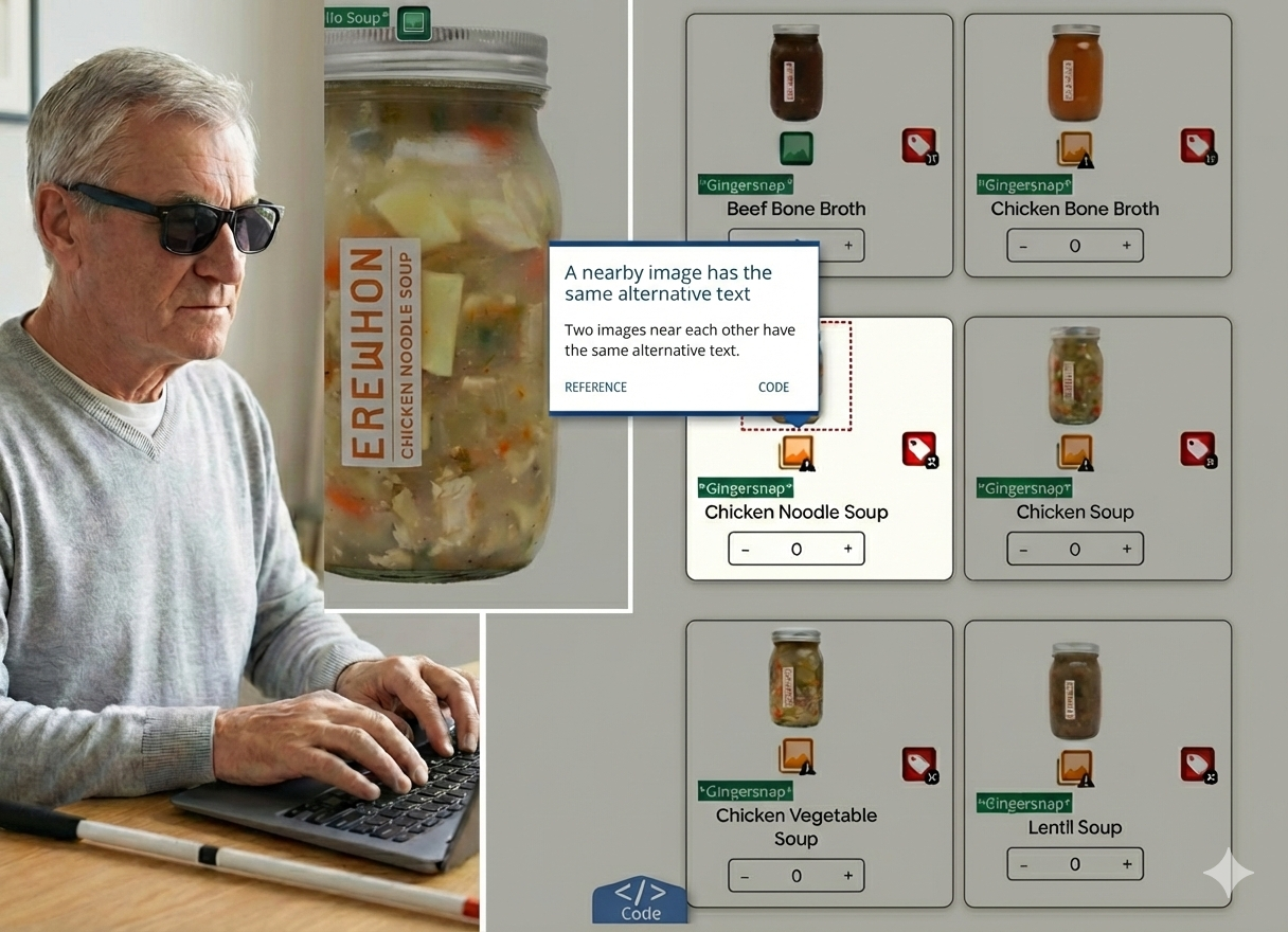
Uncovering Silent Barriers at Erewhon
Dismantling digital exclusion and resolving friction to create an inclusive experience